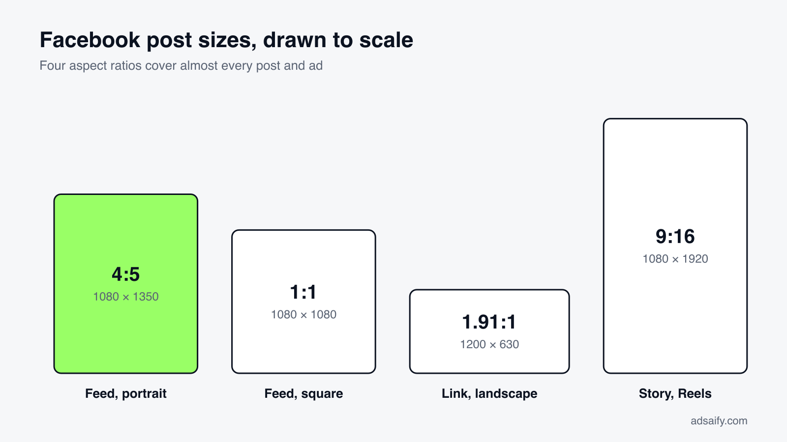
Short answer: The best Facebook post size is 1080 × 1350 pixels (4:5) for feed images, because it fills the most screen on a phone. Use 1080 × 1080 (1:1) for square posts and carousels, 1200 × 630 (1.91:1) for link previews, and 1080 × 1920 (9:16) for Stories and Reels.
Key Takeaways
- Think in ratios, not pixels: 4:5, 1:1, 1.91:1 and 9:16 cover almost every case.
- Design for the phone: most people see Facebook on mobile, so vertical formats win.
- Upload at 1080 pixels wide or more: Facebook compresses images, and small files get blurry.
- Keep important content in the middle: edges are cropped differently on desktop and mobile.
- Ads follow the same sizes, plus limits on how much text is shown before "See more".
Facebook post sizes at a glance
| Type | Recommended size (px) | Aspect ratio |
|---|---|---|
| Feed image, portrait | 1080 × 1350 | 4:5 |
| Feed image, square | 1080 × 1080 | 1:1 |
| Feed image, landscape | 1200 × 630 | 1.91:1 |
| Link preview image | 1200 × 630 | 1.91:1 |
| Carousel card | 1080 × 1080 | 1:1 |
| Story | 1080 × 1920 | 9:16 |
| Reel | 1080 × 1920 | 9:16 |
| Feed video | 1080 × 1350 or 1080 × 1080 | 4:5 or 1:1 |
| Profile picture | at least 320 × 320 | 1:1 (shown as a circle) |
| Page cover photo | 851 × 315 | about 2.7:1 |
| Event cover photo | 1920 × 1005 | about 1.91:1 |
| Group cover photo | 1640 × 856 | about 1.91:1 |
Facebook adjusts its layout regularly and does not publish one definitive size chart for organic posts. The figures above are the sizes that work reliably today; the aspect ratios are the part that rarely changes. If a design is critical, upload it and check it on both a phone and a computer before you promote it.
Feed image sizes
Portrait: 1080 × 1350 (4:5)
This is the default choice. A 4:5 image is the tallest format the feed shows without cropping, so it occupies more of the phone screen than any other image and gives people more time to notice it while scrolling. Use it for products, people, quotes and anything else that does not need to be wide.
Square: 1080 × 1080 (1:1)
Square is the safe option. It displays the same way everywhere, works in carousels, and can be reused on Instagram without redesigning. If you make one version of an image for several places, make it square.
Landscape: 1200 × 630 (1.91:1)
Landscape takes up the least space on a phone, so use it only when the content demands it: a wide photograph, a screenshot, a banner. Images taller than 4:5 are cropped in the feed, and viewers must tap to see the rest.
Posts with several images
When you upload more than one photo, Facebook builds a collage and crops the images to fit. The layout depends on the orientation of the first image. For predictable results, use the same ratio for every image in the post, and prefer squares.
Link preview image size
When you share a link, Facebook pulls the image from the page's og:image tag. Use 1200 × 630 pixels. Images narrower than 600 pixels are shown as a small thumbnail beside the text instead of a full-width card, which gets noticeably fewer clicks. If an old image keeps appearing after you change it, run the URL through Meta's Sharing Debugger to refresh the cached preview.
Stories and Reels: 1080 × 1920 (9:16)
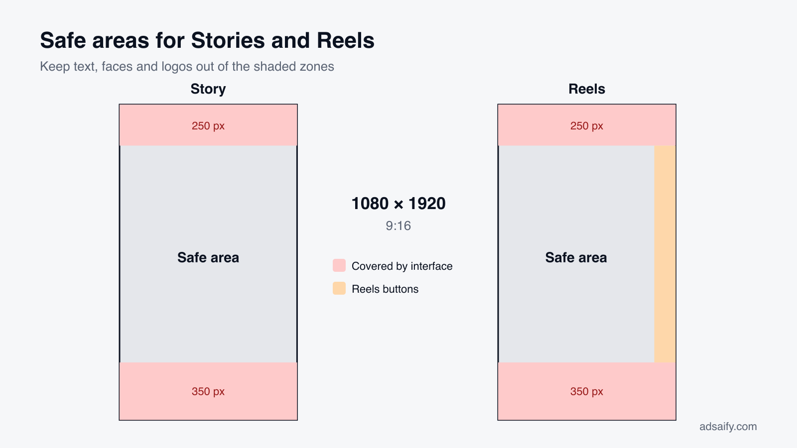
Both are full-screen vertical formats. The size is simple; the layout is where people go wrong. The top of the screen is covered by your profile name and the bottom by reply fields, captions and buttons. Keep text, faces and logos out of roughly the top 14% and bottom 20% of the frame (about 250 and 350 pixels on a 1920-pixel-tall design), and for Reels leave the right edge clear for the like, comment and share icons.
Video sizes
- Feed video: 4:5 (1080 × 1350) or 1:1 (1080 × 1080). Vertical and square video holds attention better on mobile than 16:9.
- Landscape video: 16:9 (1920 × 1080) for content made to be watched full screen, such as interviews or tutorials.
- Reels and Stories: 9:16 (1080 × 1920).
- Format: MP4 or MOV, H.264 video with AAC audio, is the safe combination.
- Captions: add them. A large share of video is watched without sound.
Profile, cover, event and group images
Profile picture
Upload a square of at least 320 × 320 pixels; a larger file such as 720 × 720 keeps it sharp. It is displayed as a circle, so keep the logo centred and away from the corners.
Page cover photo
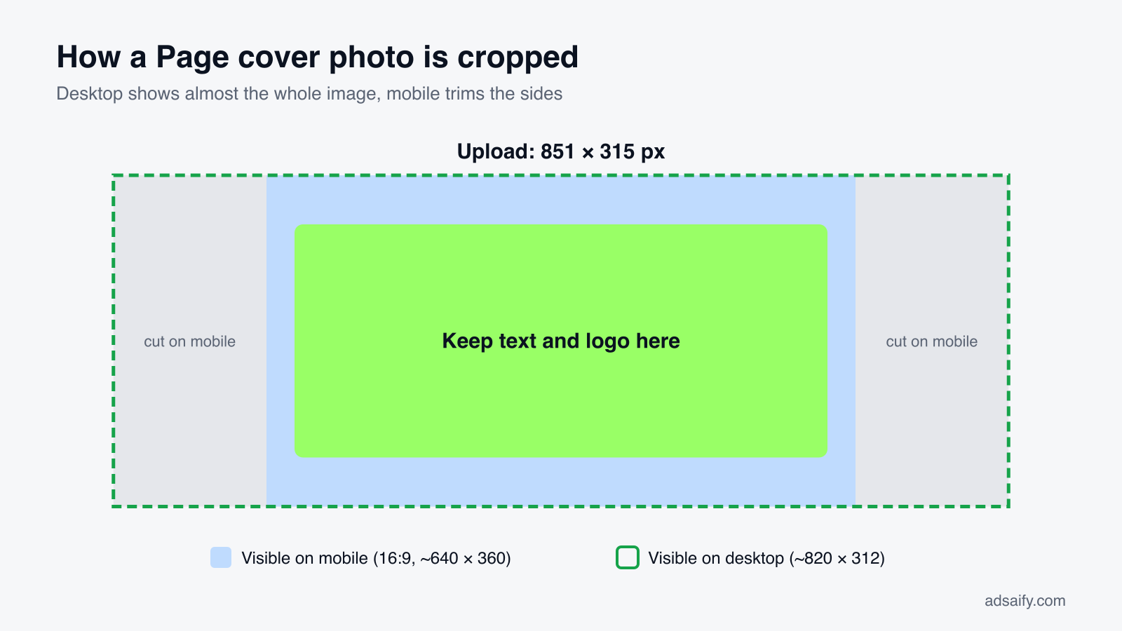
The commonly recommended upload size is 851 × 315 pixels. The cover is displayed at about 820 × 312 on desktop and about 640 × 360 on mobile, which means desktop shows almost the whole image while mobile, which uses a taller 16:9 frame, trims the left and right sides. Keep anything important in the central two thirds of the width, and avoid putting text near any edge.
Event cover photo
1920 × 1005 pixels. The title and date are shown below the image, so the image itself does not need them.
Group cover photo
1640 × 856 pixels. As with Page covers, the sides are trimmed on mobile.
Facebook ad sizes
Ads use the same shapes as organic posts, and the same reasoning applies: vertical formats take more screen.
| Placement | Recommended size (px) | Ratio |
|---|---|---|
| Feed image or video ad | 1080 × 1350 or 1080 × 1080 | 4:5 or 1:1 |
| Carousel ad | 1080 × 1080 per card | 1:1 |
| Stories and Reels ad | 1080 × 1920 | 9:16 |
| Right column, search results, link ads | 1200 × 628 | 1.91:1 |
Text limits. Ad text is not cut off by a hard limit; it is truncated on screen. As a working rule, keep the primary text to about 125 characters, the headline to about 27–40 characters and the description to about 30 characters so they display in full on mobile. Longer text still runs, but ends in "See more".
Text inside images. Meta removed its old rule that limited text to 20% of the image. Images with little or no overlaid text still tend to perform better, so keep it short.
One creative, several placements. A single campaign can appear in Feed, Stories and Reels. An image designed only as a square will be shown with bars or awkward cropping in vertical placements. Supply a 4:5 or 1:1 version for feeds and a 9:16 version for Stories and Reels, and check the preview for each placement before publishing. For current, placement-by-placement specifications, Meta's Ads Guide is the reference.
If preparing every size by hand is slowing you down, Adsaify builds the campaign from your website address: it drafts the copy and creatives, lets you preview the ad as a Feed post, a Story and a Reel, and publishes it to your own Meta ad account. Create a free account to try it.
Why does post size change how many people notice your post?
Because the feed is a column of fixed width, and the only thing you control is how tall your post is. A taller post stays on screen longer while someone scrolls.
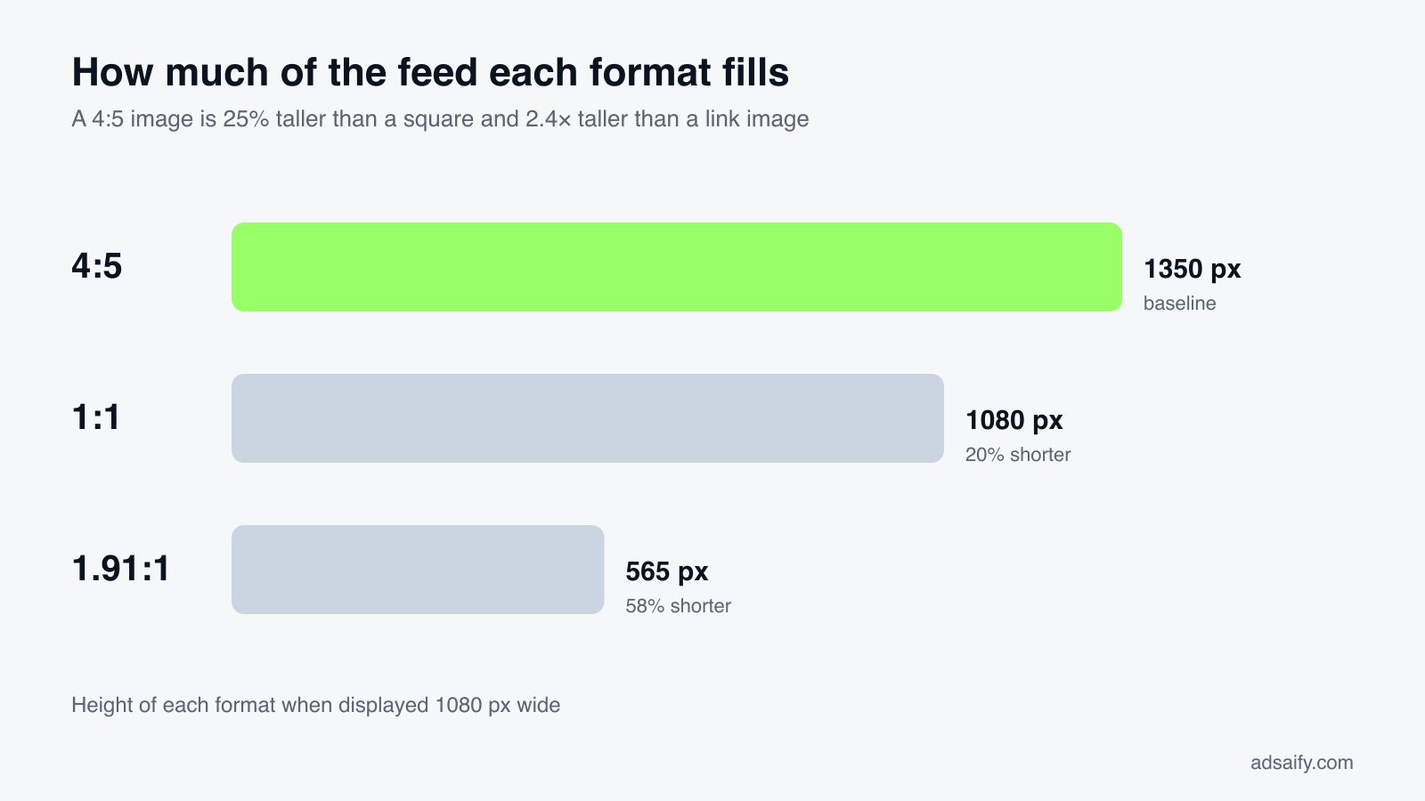
The arithmetic is simple. When three images are displayed at the same width of 1080 pixels:
| Format | Displayed height | Compared with 4:5 |
|---|---|---|
| Portrait 4:5 | 1350 px | baseline |
| Square 1:1 | 1080 px | 20% shorter |
| Landscape 1.91:1 | 565 px | 58% shorter |
Put the other way round, a 4:5 image is 25% taller than a square and about 2.4 times taller than a landscape link image. Nothing about the content has changed; the portrait version simply occupies more of the screen.
This matters because Facebook is used overwhelmingly on phones. Figures attributed to DataReportal put the share of Facebook users who access it only from a mobile device at about 82%, with only a small percentage using a computer alone. Estimates vary between reports, but every one of them points the same way: design for a vertical screen first.
Source: Business of Apps, Facebook statistics (citing DataReportal).
What size should images be when you post several at once?
Multi-image posts are where most cropping accidents happen, because Facebook decides the layout from the first image.
| Number of images | If the first image is square | If it is landscape | If it is portrait |
|---|---|---|---|
| 2 | Two squares side by side | Two landscape images stacked | Two portrait images side by side |
| 3 | One large image on top, two squares below | One wide image on top, two below | One tall image on the left, two stacked on the right |
| 4 | A two-by-two grid | One wide image on top, three below | One tall image on the left, three stacked on the right |
| 5 or more | The first images are shown with a "+N" overlay on the last visible one | ||
The exact arrangement changes from time to time, but the rule does not: every image except the first is cropped to fit the grid. To stay in control:
- Use the same aspect ratio for all images in the post.
- Put the strongest image first; it is shown largest and it decides the layout.
- Keep the subject of each image in the centre, since the edges are what gets cut.
- If the order and framing matter, use a carousel instead; each card is shown whole.
What are the sizes for carousel posts?
A carousel shows several cards that people swipe through. Use 1080 × 1080 pixels (1:1) for every card. All cards share one ratio, so a single tall or wide image forces cropping on the rest.
- Cards: between two and ten in an ad carousel.
- Each card can have its own headline and link in ads.
- Sequence: use the cards to tell one story in order (problem, product, proof, offer) or to show several products.
- First card: it has to earn the swipe. Do not use it for a logo.
What are the Facebook video specifications?
| Placement | Size (px) | Ratio | Practical length |
|---|---|---|---|
| Feed video | 1080 × 1350 or 1080 × 1080 | 4:5 or 1:1 | Under a minute for most posts; lead with the point |
| Landscape video | 1920 × 1080 | 16:9 | Longer explainers and interviews |
| Reels | 1080 × 1920 | 9:16 | Short; the first two seconds decide whether it is watched |
| Stories | 1080 × 1920 | 9:16 | Shown in short segments; longer clips are split |
| Carousel video | 1080 × 1080 | 1:1 | Short clips, one idea per card |
Upload limits for length and file size are generous and change over time, so they are rarely the constraint. Attention is. Three habits matter more than any specification:
- Captions on every video. Much of the feed is watched with the sound off.
- The subject in the first frame. The thumbnail and the first second are the advert for the rest.
- A custom thumbnail that is readable at a small size.
Is 1920 × 1080 good for Facebook posts?
It works, and it is the right choice for video made to be watched full screen. In the feed on a phone it is the smallest format: the same clip exported as 4:5 is more than twice as tall. If you can reframe the footage vertically, do.
Which size should you choose for each goal?
| Goal | Best format | Why |
|---|---|---|
| Stop the scroll with one image | 1080 × 1350 (4:5) | Largest area in the feed |
| Reuse one design on Facebook and Instagram | 1080 × 1080 or 1080 × 1350 | Both display the same on both platforms |
| Send traffic to a page | 1200 × 630 link image | The whole card is clickable |
| Show several products | Carousel, 1080 × 1080 per card | Each card is shown whole, with its own link in ads |
| Reach people who do not follow you | Reel, 1080 × 1920 | Reels are recommended beyond your followers |
| Time-limited offer | Story, 1080 × 1920 | Full screen, disappears after 24 hours |
| Event | Event cover, 1920 × 1005 | Title and date are added by Facebook below the image |
What are the detailed specifications for Facebook ads?
| Ad type | Size (px) | Ratio | Notes |
|---|---|---|---|
| Single image, feeds | 1080 × 1350 or 1080 × 1080 | 4:5 or 1:1 | Minimum width 600 px; higher is better |
| Single video, feeds | 1080 × 1350 or 1080 × 1080 | 4:5 or 1:1 | MP4 or MOV, captions recommended |
| Carousel | 1080 × 1080 | 1:1 | 2–10 cards, each with its own link |
| Stories | 1080 × 1920 | 9:16 | Keep the top 250 px and bottom 350 px clear |
| Reels | 1080 × 1920 | 9:16 | Also keep the right edge clear of text |
| Right column | 1200 × 628 | 1.91:1 | Desktop only; small on screen |
| Marketplace, search results | 1080 × 1080 | 1:1 | Shown among listings; product on plain background works best |
How much ad text is shown?
| Field | Keep it to about | What happens if it is longer |
|---|---|---|
| Primary text | 125 characters | Truncated with "See more" |
| Headline | 27–40 characters | Cut off at the edge of the card |
| Description | 30 characters | Often hidden on mobile |
These are display guidelines, not hard limits, and they differ slightly by placement. The reliable approach is to put the offer in the first sentence of the primary text and treat everything after it as optional reading.
What happens when one image is used for every placement?
A campaign with automatic placements will show your creative in feeds, Stories, Reels and elsewhere. Consider a 1:1 image with the price written along the bottom edge. In the feed it looks as designed. In Stories it is centred on a 9:16 screen with empty space above and below, and in some placements the bottom strip with the price sits under the call-to-action button. The ad still runs, but the part that was meant to sell is hidden. Supplying a separate 9:16 version avoids this.
How should you export images for Facebook?
| Setting | Recommended |
|---|---|
| Width | 1080 px minimum; 2160 px for detailed images |
| Format | JPG for photos, PNG for text, logos and flat colour |
| Colour profile | sRGB |
| JPG quality | High (80–90); maximum quality adds size without visible benefit |
| Video codec | H.264 with AAC audio, MP4 container |
| Frame rate | The rate it was shot at, typically 30 fps |
What are the most common Facebook post size mistakes?
- Designing on a wide monitor for a narrow screen. Text that is readable at full size becomes too small on a phone. Check every design at phone size.
- Posting landscape by default. It is the smallest option in the feed.
- Text at the edges. Covers, multi-image grids and Stories all crop or cover the edges.
- One image for all placements. Feeds and full-screen placements need different shapes.
- Missing or small
og:image. Shared links show a tiny thumbnail or a random image from the page. - Mixing ratios in one post. The grid crops whatever does not match the first image.
- Uploading a compressed copy. Images saved from messaging apps have already lost quality.
A pre-publish checklist
- Is the ratio right for the placement: 4:5 or 1:1 for feed, 9:16 for Stories and Reels, 1.91:1 for links?
- Is the file at least 1080 pixels wide and exported in sRGB?
- Is the subject in the centre, with nothing important near the edges?
- For Stories and Reels: is the top 250 px and bottom 350 px free of text?
- Does the text read comfortably on a phone held at arm's length?
- For links: does the page have a 1200 × 630
og:image, and does the preview show it? - For video: are there captions, and does the first frame show the subject?
If you would rather not prepare each of these steps by hand, try it in Adsaify: your first ad is free, so there is nothing to lose. Create a free account.
Why your images look blurry, and how to avoid it
- The file is too small. Anything under 1080 pixels wide is stretched. Export at 1080 or 2160 pixels wide.
- Compression. Facebook recompresses every upload. Start from a high-quality JPG, or use PNG for images with text, logos or flat colours.
- Wrong colour profile. Export in sRGB; other profiles can look washed out.
- Upload quality on mobile. In the Facebook app settings, turn on high-quality uploads for photos and videos.
- Screenshots of screenshots. Each save loses quality. Go back to the original file.
A simple workflow
- Design the main image at 1080 × 1350 with the subject in the centre.
- Make a 1080 × 1920 version for Stories and Reels, moving text into the safe area.
- Set the 1200 × 630
og:imageon every page you plan to share. - Export in sRGB, check on a phone, then publish.
Frequently Asked Questions (FAQ)
1. What is the best size for a Facebook post?
1080 × 1350 pixels (4:5) for a single feed image. It takes up the most space on a phone screen.
2. What size is a Facebook post in inches or centimetres?
Screens are measured in pixels, so there is no fixed physical size. If you are designing in a print tool, set the canvas to 1080 × 1350 pixels at 72 ppi (15 × 18.75 inches, or about 38 × 47.6 cm).
3. Is the Facebook post size the same as Instagram's?
The shared formats are: 1:1 and 4:5 work in both feeds, and 9:16 works for Stories and Reels on both. A 4:5 image at 1080 × 1350 can be posted to both without changes.
4. What is the Facebook cover photo size?
Upload at 851 × 315 pixels and keep key content in the centre, because mobile trims the sides.
5. Can I post a vertical 9:16 image in the feed?
Yes, but the feed crops it to 4:5 and viewers must tap to see the whole image. Keep the important part in the middle.
6. What file format should I use?
JPG for photographs, PNG for graphics with text or logos, MP4 for video.
7. What size should a Facebook ad image be?
1080 × 1350 or 1080 × 1080 for feeds, and 1080 × 1920 for Stories and Reels.
How can you try this with Adsaify?
Adsaify analyses your business from your website address, drafts the campaign with an audience, ad copy, creative and a budget suggestion, and publishes it to your own Meta ad account once you approve.
- Your first ad is free: there is nothing to lose by trying.
- Your own ad account: the campaign runs in your Meta account and you stay in control.
- Preview by placement: see the ad as a Feed post, a Story and a Reel before it goes live.
Create a free account and try your first ad · Already have an account? Log in.